User experience designer
Case Study:
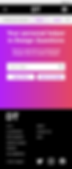
DesignTutorial (DT)
Website Design
This project was completed in a Google UX Certificate Course

Project Overview
The problem
It takes a long time to find the information you need, sort it out because on the Internet either you can find a great deal of information or you cannot find anything. In addition, the second main problem is keeping all the useful information in one place.
My role
UX designer leading the DesignTutrial (DT) website design
The goal
Design a DT to be user friendly by providing a clear and easy searching process and the ability to save useful information.
The product
DT is a website for finding and viewing design guides. A typical user between the ages of 19 and 30, college student or design professionals. DT's goal is to make the searching process quick and easy for all types of users.
Responsibilities
Conducting interviews, paper and digital wireframing, low and high-fidelity prototyping, conducting usability studies, accounting for accessibility, iterating on designs and responsive design.
Project duration
August 2021 to September 2021
Understanding the user
In the beginning, I had the idea to create a site that would be similar to Google, but only for everything related to design. Being able to easily find any information you need and have access to it at any time was the main idea.
With this in mind, I started looking for information and preparing for user interviews. It didn't surprise me that there is a lot of information about design and you can choose from a paid course to a free guide. But, frankly, it's hard to look for new information on a topic of interest to you on different platforms every time. Now the most popular platforms where creative people learn new things are YouTube, Instagram, and TikTok. And not everyone has access to it. That's why it would be great if we could search for information from all of these platforms in one place.
After that, I conducted 10 interviews with people who are into design, art, designers or artists. It was a Zoom call for about 20-40 minutes.
The most unexpected thing was that almost everyone said that communication with others is very important for them. That they prefer to communicate with other creative people from all over the world, acquire new connections and knowledge.


User pain points
Communication
Be able to communicate with others people.
Saving information
It is important for users to be able to save useful information and use it at any time.
Filters
Not all sites provide filters that affect users' search processes, so the time it takes to find the information you want increases. this is very frustrating for users.
Persona & problem statement
My next step was to analyze all the collected information. This time it was a long process, but very interesting.
To better understand user needs and make sure I'm on my way to creating user centered design, I've created two personas that help me better understand who my target users are.

Andriana is a busy designer who needs intuitive site navigation and search filters because they want the process of finding information to be fast and stress-free.
Andy is a busy college student how interesting in design to find actual tutorials and information about design easily because he wants to learn more and improve his skills.

User journey map
The next step towards a better understanding of users and their needs was the creation of a user journey map. It's a great tool to learn new pain points or test yourself if you were correct in your prediction about where in the path your user might encounter problems. Also it is a great opportunity to see what solutions you can suggest to make better user journey.


Starting the design
Sitemap
After I knew who the users were, and what their pain points and needs were, I started working on the sitemap. For me it was a challenge because I wanted to make a functional site, but easy to use.
Therefore, I prepared 6 different design categories and the ability to use different filters for a faster search process.

Paper wireframes
Wireframes
Then I sketched wireframes for each screen in my application, keeping in mind the user's problems with navigation, search, and the save process.
The home screen wireframe options on the right emphasize an easy and quick search process.


Digital wireframes
Moving from paper to digital wireframes made it easy to understand how the redesign could help address user pain points and improve the user experience.
Prioritizing useful button locations and visual element placement, search bar, filters on the home page
Wireframes

Screen size variations


Usability study findings
Once the low-fidelity prototype was ready, I got ready for the usability study. The main goal of the study was to determine whether users can perform basic tasks on a DesignT website. Determine if the website is difficult to use.
This helped me better understand what I was missing and what areas need improvement.
5 Participants
Methodology
-
Participants are all individuals who searching for tutorials in design.
-
Two males, two females, and one nonbinary individual, between the ages of 18 and 40.
-
Unmoderated usability study
-
Location: Ukraine, remote
-
Date: Sessions will take place on September 23 during normal business hours
-
Length: Each session will last 20-30 minutes
-
Compensation: sweet gift for participating in the study
Research questions
-
How long does it take for a user to find a course and complete it?
-
What can we learn from the user flow or the steps users take to find a course?
-
What can we learn from the user flow or the steps users take to learn topic?
-
Are there parts of the user flow where users get stuck?
-
Are there additional features that users would like to see in the app?
-
Do users find the app easy or difficult to use?
Key Performance Indicators (KPI)
-
Use of navigation vs search
-
Drop-off rates
-
Conversion rates
-
System Usability Scale
1. Account
Add the ability to choose which account they want to use if they have, for example, 2 Google accounts
2. Searching
Provide search suggestions when the user starts typing their question in the search bar
3. Filters
Users want more filters
Refining the design
Mockups
Based on the insights from the usability study, I made changes to improve the searching flow. I've added more filters that users can apply in their search. This allowed users to spend less time and make requests more specific.


To simplify the login process, I create the ability to use the 3 most popular accounts: Google, Apple, Facebook.


Screen size variations
I included considerations for additional screen sizes in my mockups based on my earlier wireframes. Because users shop from a variety of devices, I felt it was important to optimize the browsing experience for a range of device sizes, such as mobile and tablet so users have the smoothest experience possible.

Mobile Phone


Tablet


Going forward
Takeaways
Impact
Our target users shared that the design was intuitive to navigate through, has an easy and fast search process.
What I learned
I learned that even a small design change can have a huge impact on the user experience. The most important takeaway for me is to always focus on the real needs of the user when coming up with design ideas and solutions.
Next steps
1. Testing
Conduct follow-up usability testing on the new website
2. Ideation
Identify any additional areas of need and ideate on new features